How did you use new media technologies in the construction and research, planning and evaluation stages?
 Throughout our whole project, from research and planning to evaluation, we were relying deeply on technology. First of all, in the research and planning stage, we were mainly using the internet to research the codes and conventions of existing short films.The use of the internet allowed us access to a full range of short films for further analysis and influences; we used web sites such as YouTube and the BBC Film Network to gather short films together. However, if we did not have access to the internet, these short films would have been very difficult to gather, as they are not meant for mainstream means, such as, cinema, TV; they are usually only shown at film festivals to promote actors or directors.
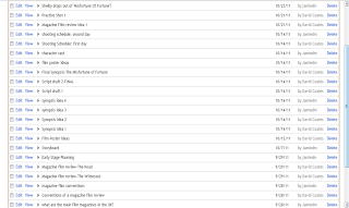
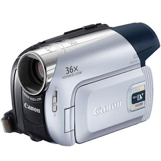
 Furthermore, we used the blogging site, blogger to document and organize our research and planning so far, therefore, this made it easy to access, and we could also communicate with our group, which helped with the production stage.At the production stage, we were using simple DV cameras which had many limitations which we had to overcome, for example, the built-in microphone had trouble picking up the sound clearly, this is why we needed a voice-over or scores,however, and this helped minimize the dialogue.
 Also, the recorded image was not the best quality as it produced a‘grainy’ image, but this suited our film to an extent because it has a social realism theme. We also used digital cameras to take images for the poster and magazine, this was helpful because the images were easily accessible, as before, you had to get them developed and you could not see the image immediately after to see if it was good quality.
 Moreover, the whole process of post-production was based on technology because first of all, to edit our product we were using i-movie HD,which is a very consumer friendly piece of software which comes free with Apple Mac, this software is non-linear meaning it is not destructive, which was extremely useful for audience feedback. As this software is free it is not professional, so there are limited functions, for example, effects and titles. Also, as we were using scores in our short film, we needed to find copyright free music; so again we were relying on the internet to provide us with a range of scores we could use.
 Furthermore, we were also using a desk top publishing program called Pages to make our magazine film review; again this was a consumer product meaning it was relatively easy to use, so we did not have to learn any new skills. However, this also had its limitations to it, so we used Photoshop to design the different logos for the magazine. Lastly in the post-production process, we had to make our film poster, this was achieved by using Photoshop, and this program does cost money as it is industry standard, so as expected it is difficult to learn, allowing us to design and create more developed poster ideas.
The last stage of our project was our evaluation. Firstly, we had to use i-movie HD again as we needed to make a podcast for our answers, which is enriched with clips from our film and other parts of multi-media. We also had to use blogger again because we had to blog some of our answers to the evaluation on here, which is again filled with relevant multi-media clips and photos. Lastly, to actually get our feedback to help us for the evaluation, we used YouTube and Facebook to easily show people, especially to our target audience, our three products, short film, poster and magazine review. Also, the internet and video sharing social networking sites are the most cost effective and realistic way for a short independent short film to reach a mass audience. 


