we decided that our potential audience would be from the ages of 16 - 25
At first, we brainstormed many themes and genres, we thought of:
-documentary
-stereotypes
-national identity
-multi cultures
-karma
-crime
-youth violence
-war
Then, we thought about the purpose of our short film and we came up with either; to portray a message, or for experimentation.
From the above themes, we picked out the ones we liked best which were: karma, documentary and war themes. we chose these as we already had some ideas in our heads, and these were the themes that would fit in with our ideas.
Once decided, we came up with two ideas each (see other posts for full synopsis), and asked the teacher what eh thought about the ideas, he helped us what else to put into it, or how to tweak it to make it better, he also told us to get rid of one idea as it was too complicated for a short film. After the feedback, we wrote up a full synopsis for the other 3 ideas, and then asked some people what they thought about the ideas. When talking to people, i realised that most people liked my story about 'good and evil' above my 'internet dationg' idea, so i didn't use that one, and we ended up with two ideas to pick from, one from me, and one frome David.
In the end, we decided to use Davids idea about money problems and war as my idea would have been difficult to think of many events for each person to do.
Thursday, 29 September 2011
Magazine film review-The Road

On the other hand, with this article it is less detailed than The Witnesses film review. Therefore, this film review from the magazine Total Film is for different audience than that of Sight & Sound. As we can see by the language used in this article, it is less detailed and only tells the main plot and narrative of the film, but not every detail. The potential audience for this magazine film review is normal film goers and people who want to know if this film is worth watching; it is probably for an 18-35 year old male audience. The mode of address for this magazine film review is quite casual, hence its potential audience is quite young. It is also sometimes humorous, for example, the caption of the photo, Glastonbury.
This film review has a variety of breakout boxes including information about predicted interest and the film running time, etc. However, they are used differently compared to Sight & Sound, where it is a full interview with the director, but in this magazine they are just used to fill up space. Furthermore, this review has a sub-title of ‘See this if you liked’, showing it is for a more relaxed, male audience; this also gives the audience a choice of what films they could go and watch.
Moreover, this review always kept on topic about the film and immediately gives any good or bad points about it. The review does not have many columns showing to the audience that there is not that much writing and it is not in much detail. There are many graphics in this review along with a large picture from the film, this also makes it more eye-catching for that younger audience, and shows only by semiotics, that its potential audience is casual and young.
We intend to use this type of casual magazine film review for our film because we do not want to reveal every aspect of our short film, as this will not suit it and we think that it would then be pointless watching the film. Instead, we intend to outline the narrative, include good and bad points and include some breakout boxes.
Magazine film review-The Witnesses

As you can see by reading this magazine film review, it is
very detailed, formal and academic, as the text makes it an intellectual read,
for example, “Somewhat against verisimilitude”, not many people would
understand what the critic was trying to say, but it is actually making the
unreal, real. Moreover, though there are quite a few pictures in this article,
it is a long read as there are many small columns and over two pages in the
magazine, immediately showing the audience this is a detailed critic review.
Also, in this review there is a breakout box, but it is different to those in
other magazines, such as Total Film;
this is another side story about the director, André Téchiné, which also comes with a very dark and
moody picture of him, portraying to the audience that he is a very serious and
confident person, so this will possibly be a good film.
The way this review ‘speaks’ to its audience is quite different to
any other from Empire, etc. It
assumes a lot about the audience in terms of what they know, and how
intellectual they are. It was possibly intended for mature people especially in
terms of film, who views film as a type of art. Also, the audience may need to
be involved in high culture to understand this review. The critic, Ginette Vincendeau, assumes that the
audience is very knowledgeable about French cinema and the language, as it uses
some words that we usually do not use, for example, Beur, is from a North African origin.
This film review seems to be split up into sections. The first
being where the critic simply introduces the film via references to other
films, which is used quite often in magazine reviews. The next part is usually
not used in a magazine film review; it is a full synopsis of the film, rather
than just an overview. In my opinion, telling a full synopsis ruins the film,
and you don’t have to watch it after, however, this is used for people
interested in the art of film. The next part of the review is the narrative
structure and style, again this isn’t really common, but how the director
approached the film maybe accepted as a common aspect of a film review. In our
own film review, we may include how we approached the film, but we will
definitely not include a full synopsis or the narrative structure because the audiences
for short film and art house films are very different, and people will not want
to watch it after reading the review.
Furthermore, the next part is a very key and good aspect of the review;
it is where the critic says what is bad about the film. After, the critic
starts to write about contextual information and academic references. Lastly
and most importantly in a magazine film review, there is the closure of the
article, where the critic ‘sums up’ the film in a few sentences. Moreover, this
is the place where the article puts a call to action, to go to another page in
the magazine; this is quite effective because you are almost certain as the
critic, that the audience will see it.
Wednesday, 28 September 2011
magazine film conventions
 section title - this shows what section you are reading in the magazine
headline - Normally the film title
strapline - used to give insight to the film
introduction - used to give insight to the film
subheading/breakout paragraphs - takes up space, and catches viewers eyes
columns - the more columns and more thinner, normally means a more serious review
pictures - normally shows a screenshot from the film
graphics and logos - could be a range of stuff, ncluding magazine logo
font and typography - serif/sans serif, bold, talics etc.
breakout boxes - used for a variety of things, for example information about the film
call to action - tells reader to do something for example, visit this website
byline - editor/writer
issue info - information about the magazine
caption - gives anchorage
Conventions of a magazine film review

The headline of a film magazine is generally the title of the film being reviewed by the critic or a short sentence that may relate or sum up the film, except this is normally used in academic magazines. Normally, the headline is in big font which immediately catches the readers’ eye. Moreover, sub-headings in a film review are used to break up the article, sometimes linking to other reviews, in this case, ‘See if you liked’. Generally, film magazines are split up into more than one section, not just about film reviews, this is why they have a section title, normally shown as a
graphic or logo, for example, Screen and Lounge. The strap lines in an article are similar to taglines in a poster, they are there to give a it more information on what the film is about, so audiences can look at it quickly and see if they like the sound of the film.
graphic or logo, for example, Screen and Lounge. The strap lines in an article are similar to taglines in a poster, they are there to give a it more information on what the film is about, so audiences can look at it quickly and see if they like the sound of the film.
Furthermore, breakout boxes and paragraphs are used to show extra information relating to the text, for example, directors cut; they are mainly used to emphasise certain aspects in an article, normally quotes, and these are also in the text, so they are just used to catch the readers’ eye hence why they are normally in different typography. The columns of an article can be seen as the most important aspect because the amount of columns will vary depending on what magazine it is, this is known as the house style. Also, in an article there is sometimes a byline, depending if the writer is well known or not, just like in film posters, the critics’ name can be in big font next to the article, small font hidden away, or not there at all.
Font and typography can be used very effectively for eye-catching ideas and is usually part of the house style of the magazine. The font is the style of lettering, for example, Arial or Times New Roman. The font can show if it is going to be a light or academic article. However, the typography is the actual appearance of the text, in terms of colour and size. An article will usually have different typography all the way through the article to make it seem more appealing. A call to action is also put in an article to make the audience visit other articles or sites for more information about other film reviews. Moreover, there is always a picture used in a magazine film review, and it is usually a screenshot from the film or an iconic image. Along with the picture, there is generally a caption explaining what is happening in the picture, sometimes the caption can be shown as a joke.
what are the main film magazines in the UK?


There are many different film magazines that do film reviews, some examples are sight and sound, Total Film and Prevue. All these magazines would have different kind of audiences, for example total film would mostly be for the male audience as could be seen from the magazine cover above, by having a picture of 'Megan Fox' on the cover, it wold catch most mens eyes and entice them to buy the magazine. They would normally have a lot of witty jokes inside the magazine, with an easy to understand style of language. the layout of the page is it normally has a big picture which takes up a lot of space on the page, with not a lot of text as most of the readers would just want to skim through the text. Total Films content would normally consist of items which would be considered manly, for example cars and the main films to be critiqued would be a film with nice cars or sexy girls.
There are also magazines that come from the cinema itself, Vue has one. These magazines wouldnt give much away according to film content as people wouldnt want ther film to be spoiled, also they wouldn't put any criticisms of the flm as the cnema would be trying to get as many people to watch the films as possible.
Main Film Magazines in the UK


Film magazines such as Empire and Total Film are similar in style because they will generally have more casual reviews, with a potential audience of young adults who just want to know if the film is good or not, and worth watching. The magazine reviews will not reveal every aspect of the film, except it may give you an outline of what the narrative is about. There are more pictures and graphics in reviews than text, and the text will be put into small columns. The way the magazine interacts with the audience is by using many breakout boxes for extra information, and trying to make jokes about things they say. Both of these magazines are split up into sections for sometimes not just about films, for example, music and watching films at home.

On the other hand, the film magazine Sight & Sound is a very well-known magazine for reviews, but for more of an academic audience, this is portrayed by the content and layout of the review. The content of the reviews is quite serious and uses very complex language, for example, verisimilitude. Furthermore, the layout of the reviews are very plain with possibly one picture from the film with lots of columns of text, immediately telling the audience it is long and detailed. The potential audience of this magazine is for people who believe film is a type of art, and are very interested to know how directors can do things.
what is the purpose of a magazine film review?
 The main purpose of a film review is to give an outside opinion to a film, this could either be a good or bad review and the makers of the film have no influence over the outcome. One benefit for films of film reviews is that if the review is a good one, this could greatly boosts sales, however if the film critic says its a bad film, then this could destroy sales for the film. If the film review is good, this could be seen as free advertising as they do not pay for the critics to review the film, but it still brings in more sales. There have been examples of films that have not let critics watch the previews of a film because the producers themselves knew that the film was not a good film, and if they let film critics review the film before the film came out, they would have lost a lot of money.
The difference of film reviews and film posters is that, film posters are made by the producers of the film, and so they would make the film poster look as good as it could be so that people would like it. The audience would rather watch a film based on the film review instead of the film poster as the film review is more honest, and even if a film poster looks good, it doesn't mean that the film itself would be a good film.
Tuesday, 27 September 2011
Purpose of a Magazine Film Review
The main purpose of a magazine film review is provide the audience with information based opinions from critics about an upcoming film, which they will be able to see very soon, and most importantly spend their time and money seeing it. A film review is different to a film poster because film posters will generally have a positive twist to it, but in a magazine it is the full review by the critic, who is able to say to the audience what he/she likes about the film and similarly dislikes. There are also many magazine film review conventions used differently to film posters, which I will explain later. Furthermore, in film reviews there are sometimes also breakout boxes which may show information about the director of the film, and what he/she wanted to do while making the film, this can be effective because it gives the audience an insight of what to expect.
 How audiences interact and understand each film review generally all falls down to the style of magazine it is in, for example, Total Film for more casual, male audiences who like witty jokes. On the other hand, there are magazines such as sight & Sound, for more serious, academic audiences who want to know every aspect of the film. However, audiences may interact with these film reviews through all of the technical conventions used, such as a call to action, where they may visit websites or call a number for further information about the film they just read about. The main way audiences immediately understand a film review is through a very common system, which is the stars, the more stars a film gets, the better the film according to the critic. Generally, audiences that read lots of film reviews and know the best critics like Ginette Vincendeau, the more they will believe the article from this particular critic.
The direct impact of a film review is extremely vital, it has the ultimate power to make or break a film, especially in feature length films as they will find it very important for the success of their film. The film review is an important part of a film’s marketing campaign because even if the film makers do not have the budget to have lots of advertisements for their film, if they get an excellent review from a well known critic, they will be very successful. However, it can be easily seen that this does contain a large element of risk because if a film got a bad review after they asked for one, they will probably not do as successful as expected.
How audiences interact and understand each film review generally all falls down to the style of magazine it is in, for example, Total Film for more casual, male audiences who like witty jokes. On the other hand, there are magazines such as sight & Sound, for more serious, academic audiences who want to know every aspect of the film. However, audiences may interact with these film reviews through all of the technical conventions used, such as a call to action, where they may visit websites or call a number for further information about the film they just read about. The main way audiences immediately understand a film review is through a very common system, which is the stars, the more stars a film gets, the better the film according to the critic. Generally, audiences that read lots of film reviews and know the best critics like Ginette Vincendeau, the more they will believe the article from this particular critic.The direct impact of a film review is extremely vital, it has the ultimate power to make or break a film, especially in feature length films as they will find it very important for the success of their film. The film review is an important part of a film’s marketing campaign because even if the film makers do not have the budget to have lots of advertisements for their film, if they get an excellent review from a well known critic, they will be very successful. However, it can be easily seen that this does contain a large element of risk because if a film got a bad review after they asked for one, they will probably not do as successful as expected.
Tuesday, 20 September 2011
What are the main conventions of film posters in terms of technical codes?

 One of the conventions of a film poster is obviously the film title, without the film title we wouldn’t know what film it is. However there are exceptions to this, one being Harry Potter6(right) which only had a picture of the main star Harry Potter played by Daniel Radcliff, and the word 'HP6', as Harry Potter is such a well-known book and film, and the scar being a well-known iconography that by just having these things on the poster, everyone knew what film it was and that the film was coming soon.
 |
| This is an example of a billing block from the film Watchmen |
Another convention is a picture of the main star, which is usually shown in the foreground of the poster. If the film had an A-list actor being used, these would normally be the person that would be shown as when people see the picture of the A-list actor, they are more likely to go see it, this can be seen in the INCEPTION film poster shown above, Leonardo DiCaprio is the main person because he is well known, and also the main protagonist in the film. Linked with this is the Star name, this would have all the main stars names shown, and if an A-list actor is used, their name would probably be quite big aswell to catch peoples eyes.
The tagline is a line, that is normally catchy, sometimes funny, that would give some insight into the film, and also make people want to watch it, it could include a red-herring or other sorts of techniques to get viewers interested.
The background image, normally gives a insight of the themes and genres of the film, also might give more informatin of what the film is about.
Saturday, 17 September 2011
Conventions of film posters

This film poster shows many of the main technical conventions for creating a film poster. Firstly, it shows where the film may be generally based, in this case, mainly out on empty fields, showing they are at war, which is further emphasised by what the characters are wearing. Also, where the characters are placed in the poster seem to be up in the air, in the mist, connoting that these people have died. Furthermore, there is one person standing in silhouette, showing that the army will carry on through day and night.
The main character in this film, played by Tom Hanks, can easily be identified because he is in the front of the three other people, and the markings on his helmet show he is in charge of the others in the film. The colours of this film seem to be quite dark and grey, connoting that the designer wanted to show a message that there is no bright side to war. Moreover, the tag line and title of the film work very well and close together as the word ‘saving’ is in bold; and the tag line ‘the mission is a man’, connotes that a squad has to go and save this man, that is their mission. The poster shows that the conventions of film posters were created for the purpose of
 showing the audience what this film is about, without revealing too much information so they will watch the film.
 Generally, film poster will definitely have the film title, the name of the star and an iconic image for the film. However, occasionally designers of film posters will not include the title of the film, when it is coming out or any of the stars; for this to work effectively the film must be well known and the poster must include a very iconic image, for example, Harry Potter six.
Moreover, semiotics of film posters are equally important because this is what makes the poster eye-catching, and they will be used to make the audience quickly process a lot of information, just from the visual imagery contained in the film poster. Film poster designers must be aware of images, colours and the layout of the poster, if they want to make it successful where the audience is able to remember a lot of information.

After analysing the film poster for the film Johnny English, I have seen that taglines are very important for a film poster to have. They must be catchy, able to sum up the plot, tone or themes of a film, and has enticing short phrases. In this case, this poster uses short sentences and the rule of three. The tag line of a film should reinforce what the film is about.
The tagline is possibly one of the most important aspects of a film poster as the audience will always read it and see if they like the film, therefore, the tagline must give extra info about the narrative and what audience it would suit. Also, tag lines should be easy to remember so the audience can check out possible trailers later. Furthermore, they will become well known over time, even to people who still haven't seen the film, so it must be effective, for example, "Same make. Same model. New mission"-Terminator 2 and "He's having the worst day of his life. Over and over..."-Groundhog day.
Moreover, film tag lines must give a bit of the narrative away because occasionally they may pick a title that it strange to the current audience and time, for example, Groundhod Day; it was known as just a holiday, but now is a well known film about a person having the worst day of his life. The tag lines for films become effective because they use many literature techniques, for example, the rule of three and short sentences, used in Johnny English. Also, balance, repetition and rhyme can be used very effectively for film posters, like in Sleepless in Seattle.
film posters through time

Metroplis by Fritz Lang (1927)
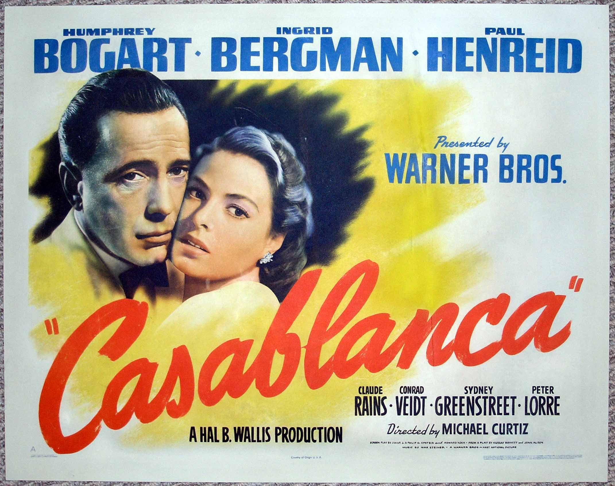
Casablanca directed by Michael Curtiz (1942)
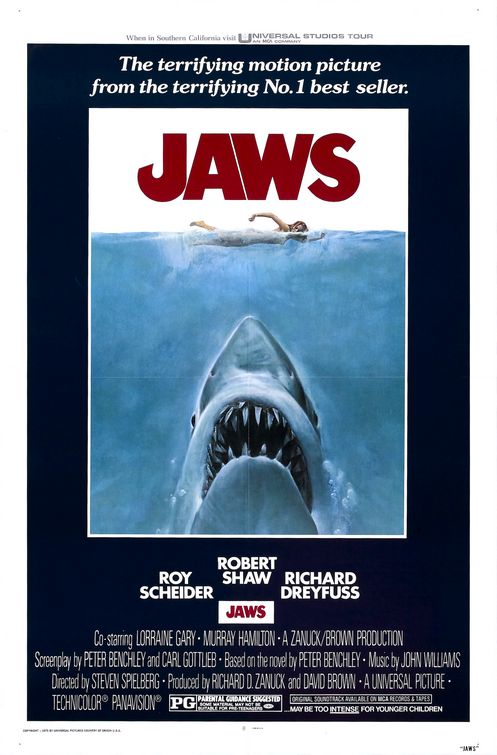 Jaws directed by Steven Spielberg (1975)
Memento directed by Christopher Nolan (2000)
There have been many changes to film posters over the past decades, one being the production of the film posters. Before, film posters used to be drawn out, but more recently, thanks to the development of technology, film posters have been able to be done by computer giving better quality pictures, and making them more appealing to the public. The development of technology has also made film poster 'move', making it easier to catch someones eye.
How film posters have developed over time

From the film Passport to Pimlico (1949) by Henry Cornelius

From the film Psycho (1960) by Alfred Hitchcock

From the film Papillon (1973) by Franklin J. Schaffner

From the film The Titanic (1997) by James Cameron

From the film The Bourne Ultimatum (2007) by Paul Greengrass
This shows how film posters have developed over time. It shows that with the earliest film posters, like Passport to Pimlico, seem quite hand drawn and do not have that much detail on them, so some main conventions for film posters were not written yet. However, as you look at film posters from the 60's and 70's, like Psycho, there tends to be plain images but again still not much information because this was when going to the cinema started to become popular. Finally, the relatively modern film posters have been well thought about and seem more eye catching because they use iconic images and many of the main conventions, for example billing block, picture of the star and background images. However, all of these film posters have been successful because they were full of semiotics and very eye catching for their time.
what is the purpose of a film poster
 Film posters are useful as they are shown in various locations around the country for example in newspapers, magazines and on the underground. They are seen by a lot of people and a wide variety of people.
One of the purposes of the film is too advertise the film to the public, and get as many people as possible to watch the film, it does this by giving a positive representation of the film, for example they would normally show parts of reviews like ‘5 stars’ and ‘a stunning piece’, it should also give people information about the film, for example showing the themes and genre of the film (1) and should give the audience an insight to the narrative of the film. A film poster should also highlight the main stars in the film(2), most of the time being in the foreground, this makes the audience more likely to look at it as it’s a well-known star playing a role in the film, sometimes highlighting the director too if the director is famous, for example ‘Hitchcock.’ Another purpose is the distribution information, for example, where and when is the film going to be released (3)

Purpose of film posters, Where do they appear?How have they developed over time?
The main and obvious purpose of a film poster is to advertise a film. However, film posters will always have a positive ‘spin’ on it, of which most of the audience is aware, for example “amazing” or 5 stars, etc. Furthermore, film posters are used to show information about the film to an audience. Mainstream films will generally highlight the ‘stars’ in the film, as the main actors/actresses will be well known. On the other hand, a short film poster will not have the names of actors in huge letters because people have not heard of them. So we intend to not put the stars names in our film poster, as this would be seen as pointless.
Moreover, information about the production crew will generally be on a film poster, especially the Director. Occasionally the directors’ name could be in big letters, only if he/she is very well known to the public audience. A film poster will make the audience aware of the plot/narrative and title of the film they are advertising and this will also give the audience a good idea of what themes/genres it contains. These posters also show the audience suitability, for example, what age classification does it have?
However most of the time, mainstream films will create two or more film posters, made for different audiences, so more people will be interested in the film and go and watch it, which is good for mainstream film makers, as they are profit orientated. Therefore, creating two or more film posters for a short film is out of the question. A classic example that created two film posters was the well known film Romeo and Juliet by Baz Luhrmann.


Both of these film posters where obviously for the same film, but seem to show completely different themes for two different audiences, although this is a well known story of two lovers. The first film poster (left) is meant for people that enjoy watching romantic films. However, the second film poster (right) is meant for the people that like to see action in a film between the gang war of the two families.
Another example of this two film poster method was Elizabeth by Shekkar Kapur. However, with this film they wanted to attract an International audience, so they created a poster for the US and another for the UK.


The US film poster (top) was made for audiences that were interested in the passion of Elizabeth; this was shown by the red, glossy background that also connoted love and lust; which is usually not associated with Britain. On the other hand when you look at the UK film poster (bottom), it was split into four sections with different characters along with captions: “Heretic”, “lover”, “Traitor” and “Assassin”. Therefore, this film poster was meant for the people that enjoyed thriller films, with a bit romance.
Lastly, film posters will show distribution information, for example, it will include when/where it is released-“in Cinemas near you”, if it is local. Also, sometimes they will include a ‘call-to-action’; for example, visit this website for more details, etc...
Film posters may appear wherever you go, this is intended by the film maker to advertise the film to many people, and generally it allows commuters to see film posters because they may not have time to watch TV. Therefore film posters must be eye-catching and use lots of semiotics.

Film posters sometimes appear on billboards, which are normally next to main roads for drivers to glance at while they are driving; this is why they must be eye-catching, so they can remember the name of the film.
Film posters can also be shown at bus stops and train stations for commuters to look at in the mornings and evenings. Again the title needs to be in big letters so as they glance at it, they will instantly look at the title. Lastly, film posters are shown at cinemas to show what is coming out soon, and probably at that cinema, so therefore it needs to be eye-catching for people to want to watch it.
Film posters have developed over time because they only used to be shown at cinemas and some film posters where hand drawn. However, they have been so effective because they have always been very eye-catching with the use of semiotics.
Research on themes for our short film
Choosing the theme of any film is very important for any film, including feature length ones. It is a very key part for short films as they are so short. The brief of our project was to make a British short film; therefore we had to think of British stereotypes and themes pertinent to our British identity. So we would have to go against mainstream and well known themes, to make our short
 film.
film.


film.The first theme that we as a group thought of was class and status. We got the idea from the very well known British film, Brief Encounterby David Lean, as it shows many examples of how class and status affects your life and who you talk to. However, some people do not think that class and
status can be shown today, but we have recently been shown an example with the chaotic riots in London and Birmingham. Therefore if this theme ended up as the final one, people watching it would highly classify it as British.
Another theme we thought of we believed was a more commonly used one of youth violence and crime. However, we thought that portraying a message of responsibility to our audience could help this situation. Being teenagers ourselves we have seen this, and would be able to show a very moving message to our audience. We identified this as a British theme due to the riots in London and also the many victims of knife crime around the UK, and so, this would be related to Britain.
Furthermore, another theme that we thought of was multiculturalism and the ‘Big Society’. We thought of this when we saw that after the riots, people of them communities and even others, people with different cultures came together to help clean up. This also shows that Britain is a multicultural nation, and this theme is accepted as British.
We also thought of making a social realist film. This again is a more commonly chosen theme for short films as it there are many films that follow it, for example, Get off my Land by Douglas Ray, and Gravity by Colin Hutton.
The last theme we thought of was national identity and stereotypes. British people are usually seen with no expression on their face; however, some are shown as quite happy or ecstatic, for
example in the film Sign Language by Oscar Sharp. Furthermore, British people are shown as in somewhat awkward compared to other nations, for example, the film Veronique By Patrik Bergh, shows how British people can be awkward around the ‘glamour of France’. Therefore, using one of these stereotypes or others in our film will definitely be related to British film.
Wednesday, 14 September 2011
Our Potential Audience

After reviewing the potential audiences for many different existing short films, we have come to a decision that we would like our film to be for 16-25 year olds. We both agreed on this age range because we aim to make our film for the ’15’ age classification according to the BBFC, therefore, this should be ideal for our short film, as there is no big restrictions of what we can include. Our decision for the audience for our film mainly came when we started to review the main audience of short film sharing websites, for example, YouTube. We thought having a similar target audience to this would enhance more people to watch our short film, become interested and follow on the message we may portray. Audience is such a big aspect of short film because there will be little or no advertisement for these films, so the more people that watch them, the greater the chance it will be noticed by a mainstream company to make a feature length film.

Furthermore, I believe we will want to portray some sort of message in our film, and if the potential audience was 16-25, it could be easily aimed at youths with a related message, for example, Gravity by Colin Hutton and responsibility. I also believe that with this age certificate, it has a mass audience allowing the message to be easily spread across and the distribution would be easier, as you could show it in schools for year 9/10 onwards.
Short Film analysis
After watching and researching the short film, Get off my Land directed by Douglas Ray, I have seen that it was entered for many international Film Festivals such as, Edinburgh, Chicago and Palm Springs, along with many other screening events. Also, I have found out that Douglas Ray has worked along side very successful directors, and now is a director for advertisements. Therefore making this short film was an experiment on what he could do.
Furthermore, this short film's audience is for middle/working class female adults aged 25+, as it shows elements of which it could be a Soap Opera, like Coronation Street and Emmerdale. This could be viewed after work or later in the evening. It is shown as an emphasis on family life and personal relationships, with a more social realist story line. This film could be seen as covering themes such as, Upper Classes, arrogance, country and city people, and old fashioned ways, for example, fighting for land.
This short film has a linear narrative with parts of a circular one, as the same behaviour returns later in the film but with a different character. Moreover, it is quite an objective, restricted narrative because it focused on everyone's feelings about the situation. There is a very simple plot due to time constraints, but with a twist, as the farmer agreed to fight, but he had a gun. The film was done in real time in a true country environment, therefore it is quite open although it is scripted.
The film has been filmed with a hand held camera, and at parts, slightly kinetic to make it seem more realistic. Throughout the short film you can hear the ambient sound of the countryside, which may have been added in the studio. Lastly, the titles were not shown as very important as they were quick, however this was due to time constraints. The production titles started the film, and the main title was shown after a clip. At the end, ambient sound was still playing but over a black screen showing the roles of the production team, for example, Editor and Writer, therefore this was longer than the pre-titles.
short film analysis
Adjustment Directed by Ian Mackinnon
This short film is about the relationship between a man and woman. One of the narrative Structures used is the linear narrative as all events are chronologically shown, however, there are elements of non-linear narratives as we see clips from the past, however as it is being shown on a video camera in real time. This shot film has a narrator, and is set in the style of a monologue as we are hearing his thoughts. This style would be good for our short film, as the video cameras that we would be using would have low quality microphones, which do not pick up sound well, so with a monologue, we can record the sound inside and there would not be any noises we do not want.
Throughout, there is a low score playing with a narrator speaking on top. The score is useful as it plays along with what happens in the film, and when something bas happens in the film, and when something bad happens, the score becomes more drastic to suit what is happening.
The film starts with a simple plain title on a black background; however it is only shown for less than 2 seconds which is useful for a short film as there are time constraints so titles can’t take up too much time. The end credits are set in the same format as the starting titles, throughout the end credits, as there is a sad ending, the score compliments it.
The themes employed in this film Is ‘separation,’ which can also be linked to British identity as it is though that England can’t hold down relationships.
The purpose of this film was for it to be used in a film festival or a competition, probably made by a film student, however judging by the quality and the time taken to make the film, it may have had a bigger budget.
Tuesday, 13 September 2011
what are the potential audiences of a short film?
The potential audience of a feature length film and a short film would be different as the purpose of each would normally be different, feature length films being profit orientated would normally try appeal to the greatest audience and a big range of people.
The potential audience of a short film would change depending on what the purpose of the short film is, for example educational short films would tend to be aimed at school kids. A short film designed to teach how to count would be aimed at key stage 1 children and a biological short film would be aimed at secondary school children. Also short films that are made for self-promotion would be aimed at 30+ as they would need to attract the eyes of film producers.

Monday, 12 September 2011
Potential Audience for a Short Film
The potential audiences of short films are different to those of mainstream films due to funding and distribution. As short films are generally non profit orientated, they will not spend too much money trying to distribute their film; therefore, it will possibly be only available on YouTube and specialist TV Channels, with the fair few going to film festivals, for example, Cannes. Short films are certainly not aired through mainstream cinemas such as,

Vue and Cineworld; unlike feature length films, for example, Pirates of the Caribbean, where they will be shown in cinemas. In addition, short films will find it quite hard to find any financial sponsors to be able to make their short film into a feature length one. Also, because most short films have very little money invested in them, they will sometimes be filmed only using a hand held camera, which can be good to add realistic features, but does create a grainy image to the audience even if not intended. Therefore, as short films are not shown in cinemas and especially not in highest quality, adults 30+ are generally unlikely to watch these films because they have a stereotype that they will only go to cinemas to watch films, and will not use computers.
After watching the film Gravity by Colin Hutton, I now believe that it was made for youths living in very urban communities, where there may be a relatively high general crime rate. The short film was meant to be shown in secondary schools from year 10 onwards to teach them a clear message on responsibility of their actions.
Double Take by Toa Stappard was made for the target audience of 14-25 year olds. This film was also created for people to take responsibility, and possibly also to make the audience aware of consequences of theft, like ‘Karma’, what goes around comes around.
The short film Kinesiology by Richard Shaw was made for the target audience of young adults, and for people who slightly doubt decisions in life. This short film can be seen as a documentary for young adults about life.
The development of new technology and websites such as YouTube, has changed the audience greatly because now short films can be easily watched, via the Internet by simply searching ‘Short Films’, it will even come up with suggestions of what genre or style of short film you would like. Before, a person may have to attend film festivals or competitions to see short films, but this development has made distribution for film makers easier and cheaper to do for a much wider audience.
The British Board of Film Classification (BBFC) is responsible for the classification of films in the UK. Every film must have an age certificate give by this organisation,

which will obviously limit who watches the type of film. The BBFC set guidelines for film makers which they must abide by if they only want a certain age range to watch their film. There are guidelines for each classification they can give a film, for example, U and 12.
If a short film was classified either with ‘U’ or ‘PG’, the amount of suspense and tension
 would be restricted to a limit. As the possible audience would be young children, they may not understand any messages portrayed. After watching some short films, I have noticed that a lot of messages wanting to be portrayed are aimed at people at school about responsibility, therefore, this is ideal to fit a ‘15’ age certificate, as they can keep to the conventions of a short film, for example, suspense and tension. However with a BBFC certified ‘12’ age rating, there still may be some restrictions against short films, for example, only mild tension is allowed with only some light violence.
what is the purpose of a short film?
One of the main differences in purpose of a feature length film and a short film is that full length films are mainly made sp that they can be shown in cinema or be published to DVD so that they can make profits. Short films on the other hand have many different purposes. one purpose being self-promotion or to gain experience, one example of a short film that was made for this reason is Panic Attack directed by Fede Alvarez, he created a short film which consisted mainly of animated sequence, and once was published, within two days, it became a viral video and was viewed by thousands of people. With this short film, Fede Alvarez was given a chance to work on a feature length film.
Another reason a short film may be made is to communicate a message, this could be an educational message, or to highlight some problems in society. One short film that has a message is Gravity directed by (find out name), this highlighted the rising teen gun crime in England, and that accidents can happen accidentally if you play with guns. This would make people more aware, and if shown in schools, can persuade school kids to look out and don’t be influenced.
Experimentation is another reason that directors would make a short film. It can be used to try out new ideas such challenging what the audience would expect, this links in with short films sometimes being used for experiments, by challenging this, they can see how audiences would react to it, and if the reaction is positive, they might implement it into a feature length film.
Purpose of a Short Film
The purpose of short films is very different to the purpose of mainstream, full length films. Usually, the main purpose of short films is for self promotion of directors, so they can gain experience to become well known. In fact, most very successful directors started off this way, for example, Christopher Nolan first made short films such as Doodlebug, but he then went on to make mainstream films, such as Inception.

Another example is Panic Attack by Fede Alvarez. This film was put on YouTube only as an experiment from an unknown director, however, when it went viral with over 6 million views, he was offered a $30 million contract.
Furthermore, short films can be made for film festivals or competitions, such as film 4 film competition. This is in order to self-promote themselves to mainstream companies and to become well known.
Occasionally, some directors want to communicate a message to the audience by making what is known as a trigger film, so they have had to think about where they would show it, for example, Gravity by Colin Hutton portrayed a clear message of taking responsibility of your actions.
Moreover, short films could be made because the directors wanted to experiment what new ideas they could do and see if a certain theme works; this is why you can get challenging or alternative themes in a short film. Most of the time, experienced directors experiment with short films before they change it into a feature length film; for example, Alive in Joburg by Neil Blomkamp late became District 9.
Subscribe to:
Posts (Atom)